To come up with emails that won’t go to spam, keep the following components of a great message in mind.
Catchy subject line

Subject line matters. Unless you grab the customer’s attention with the first line, you are doomed to fail. A user will ignore your email, and after a few unopened letters, all your emails will be directed to spam. We bet it isn’t what you want for your business.
When writing a subject line, make it short, interesting, funny, urgent or intriguing. Here are some great examples of catchy lines:
Hey! We picked these for you
Don’t walk away
You forgot something. Come and grab it
Come back! Don’t be a chicken
Your air humidifier is waiting for you
Don’t make me upset and finish your shopping
You can always go for something simple: “You left something in your cart” or “We saved these items for you”.
People love discounts and special offers. If you can provide some bonuses, mention that in your subject line. And set some time limits to induce buyers to empty their carts faster. Fear of missing out can work wonders for your business.
Empty your cart with 15% off
25% off on your entire order for 25 hours only
Make avail of free shipping today only
You deserve the best. Get a 15% discount today
Last chance to scoop up your left items. Hurry!
7 hours only to get 25% off on your order. Ready, set, go!
Email marketing platforms enable merchants to send customised messages to the right people at the right time. But you can always add even more of a personal touch to your emails. Address your customers by their names and be specific in your message. Here are a couple of examples:
Hey, Jane! You forgot your favourite leather pants in the cart
Rachel, your cart is curious to know where you are
So, your phone doesn’t need that awesome silicon case?
Your subject line is a pitch! Fine-tune it until it’s perfect. After all, the email that never gets opened makes no sense.
Clear-cut call to action (CTA)
An email CTA is a short message designed to encourage a person to finish their purchase. It’s usually a noticeable button that leads back to the shopping cart.“Noticeable” is the one that isn’t hidden at the bottom of the page and differs from the text written in the email.
When asking for a prompt response from a customer, be nice. Don’t force a recipient to take action but kindly offer to resume the order. Avoid such words as “buy”, “purchase” or “pay”. They aren’t taboo, of course, but they push people to do what they might not be ready to do at the moment.
Write something to encourage shoppers to take the next step:
Go to cart to view more
Return to cart
Check left items
Get your [product name]
Redeem your cart
The copy that has the vibe
Copywriting is the key to your almost-lost customers' hearts. Depending on the message you write, you can redeem abandoned shoppers or make them throw your email to spam.
The copy should be clear, catchy and compelling. After all, you want to stand out in a cluttered inbox.
No matter what writing style you choose (funny, formal, casual), use a friendly tone of voice and avoid unnecessary details. Write with these points in mind:
- a customer added something to their cart;
- they left it;
- they should come back and finish the purchase.
Left products
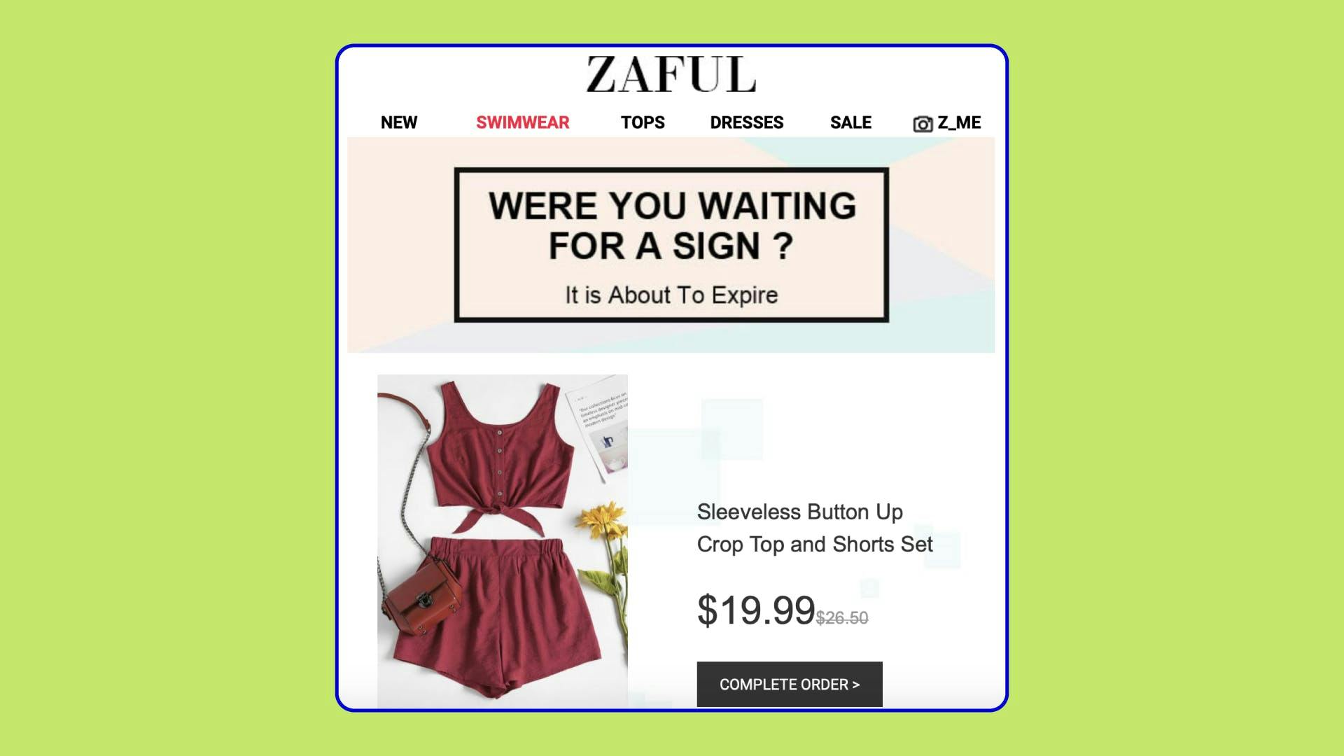
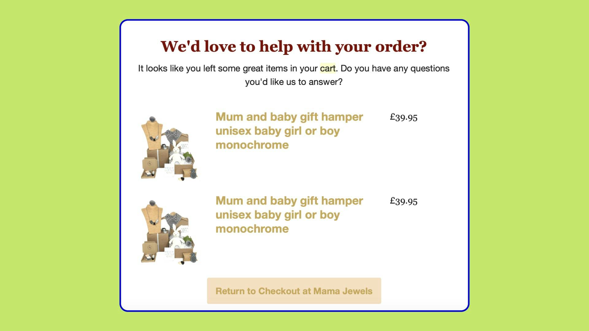
You should showcase what your client left in the cart. Provide the name of the item with its price and a picture. Sounds obvious, right? But merchants who overlook this point are losing their potential revenues.
A user might not remember what exactly they were looking for in your store. And when they open your email lacking that essential data, the chances are it’ll be directed to the spam box or deleted. Anyway, you’ll fail to convert the lost client.
Noticeable graphics
The email design aims to catch your customer’s eye in the first place. People are unlikely to read your enticing copy if the graphics aren’t eye-catching. The rule of thumb is: CTA, subject line and the whole message, in general, can convert the almost-lost shoppers, but visuals are crucial to make them notice your email.
Let’s see how to design a genuinely head-turning email:
- Say “no” to stock photos. Even though they’re beautiful and of high quality, they are impersonal. Instead, use them as the basis for your own graphics without producing pictures yourself. You can make avail of such services as Crello, Canva, Pablo, PicMonkey and others.
- Opt for dynamic design. It is more powerful than the static one and can add the needed spark to your email. Try animated gifs, slideshow, short videos and see how they work for your conversion rate.
- Put a premium on choosing colours. If you have brand colours, jazz your email up with them. You can also make a CAT button yellow, orange, green or red. These are the colours that generate conversions better than others.
Tempting alternatives
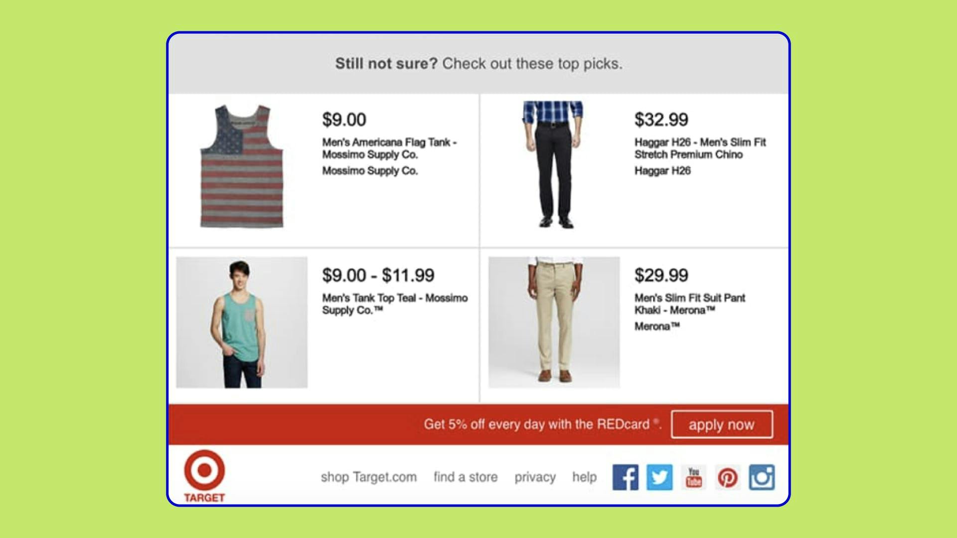
“You don’t want this. Perhaps, you might like that” – stick to that approach to lure people into buying from you. A client may hesitate to buy the item because they aren’t 100% sure about it. Stay ahead of the curve and together with the original product left in the cart showcase similar things that a customer may fall in love with.
Don’t get us wrong. You shouldn’t offer dust-covered products or those that go with high price tags. Alternatives should be similar to the items your client chose in the first place.
Showcase 2-3 accessories that will nicely complement the left product. You can also offer different colours or patterns of it.
Cart recovery email sequence
Two emails are better than one. Three emails are just perfect for nudging the lost shopper. Don’t limit yourself with one message but consider creating a drip campaign. It is a marketing strategy when letters are sent to the prospects one by one over time.
Here is how a drip campaign looks like:
Email 1. It’s a reminder sent a few hours after a shopper abandoned their cart.
Email 2. A follow-up letter sent a few days later.
Email 3. It’s a message that contains a special offer for a client. Send it after a couple of days.




 Most Popular Payment Methods in the World: Analysis by Markets
 How to Increase Conversions in an Online Store with a Checkout Page
 How Tranzzo Simplified the Payment Process for Tickets.ua
 Integrating Multiple Payment Methods: Challenges and Solutions
 Abandoned Shopping Carts: Why Businesses Lose Revenue and How to Increase the Number of Successful Payments