Now that you understand the power and importance of the mobile-friendly design, here are a few more things to consider when making your business appealing to smartphone users.
1. Keep the thumb zone in mind
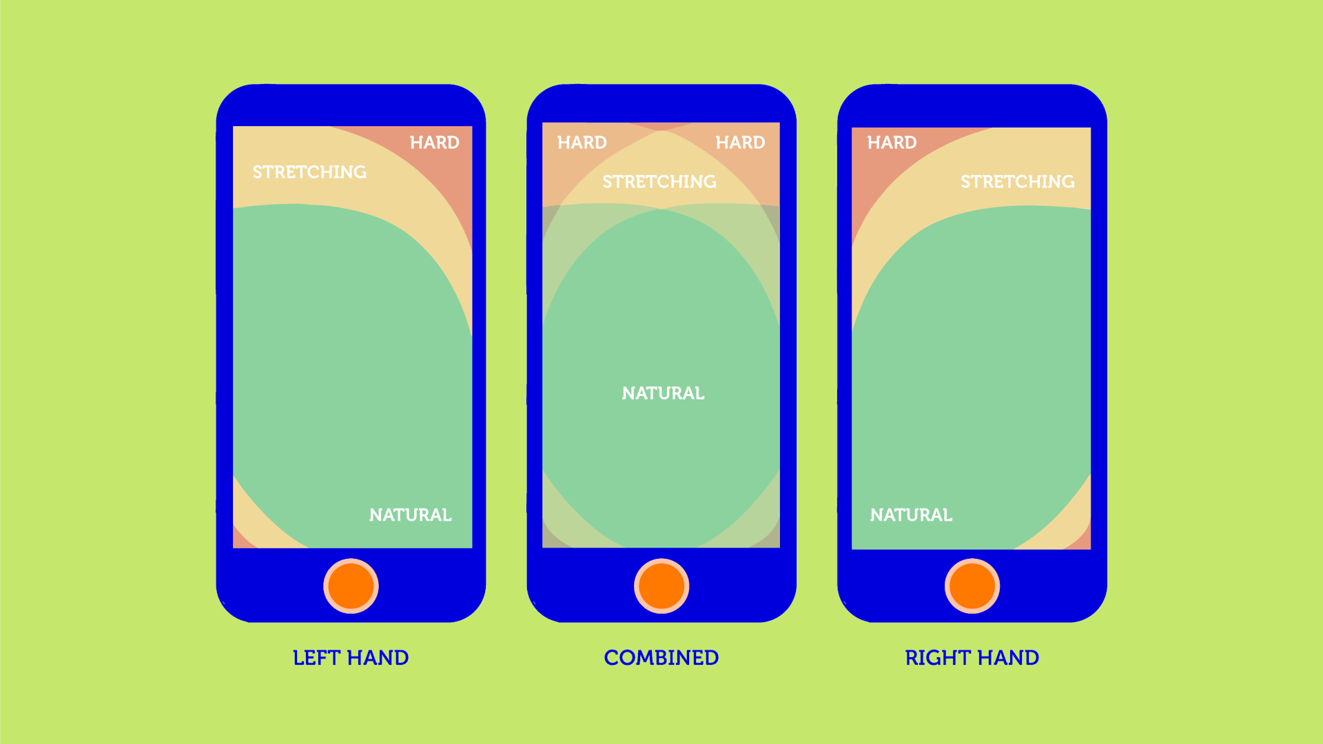
Easy-to-manage navigation is the key to your website success. First off, buttons need to be big enough so users can easily push them with their fingers. They also must be separated from each other by enough space. You don’t want your visitors to click several buttons accidentally, do you?
Button size is truly important, but the placement of the clickable elements on the screen is even more critical. Statistics say that 75% of smartphone clicks are thumb-driven. And if a user can’t reach whatever they need to with their thumb, they get frustrated and might leave. So, don’t lay any essential elements in the corners or at the top of the web page. Alternatively, make sure to place them all within a thumb’s reach.
People don’t only push buttons with their fingers. They also need to zoom in on small objects by pinching and swipe pictures by moving their fingers over the screen. If you don’t want to lose customers, add those functionalities to the mobile version of your site.
2. Weed out complicated fields
We all turn thumbs down on filling in zillions of complicated fields when ordering something. When it comes to smart devices, things get even worse, especially when fields are too small to be tapped with a finger. Unless you want your visitors to struggle with lots of useless lines of the fill-out form, get rid of them. Otherwise, that can kill your conversion rate.
Keep your checkout form as simple as it’s possible. You don’t really need to know your buyer’s favourite movie genre. Billing and shipping details are all that matter. And make sure to turn off the autocorrect function. It is really annoying to fill in the mail address over again just because the system doesn’t believe it starts with a small letter.
To lure visitors into your subscription, think twice before putting in one more line to the form. If you collect email addresses to get users to subscribe to your email list, don’t ask their phone number, age, gender and whatever.
3. Ensure smooth payments
Your products can be top-quality, and your site is mobile optimised, but if you don’t provide customers with seamless payment methods, you won't get paid. With this in mind, offer your visitors as many payment solutions as you can.
Nearly75% of buyers prefer covering bills with their bank cards. Add this method to your online store, and rest assured that they will be grateful for that. Apple/Google Pay is another must-have solution for mobile business. Given the customers’ love to get what they want in a click, you’d better provide them with this payment option. If you sell abroad, consider adding different currencies so that foreign buyers can shop on your site in a snap.
Here at Tranzzo, we can’t make your site mobile-friendly, but we definitely know the ropes in payments. Among our solutions are recurring billing, card and one-click payments, online-invoicing, and so much more. Besides, we not only offer payment instruments but also monitor all your transactions to keep them on the safe side. By leveraging a three-level anti-fraud system, we prevent any fraudulent machinations ever possible.
Take a glance at our pricing plans and ensure a seamless shopping experience for your clients.
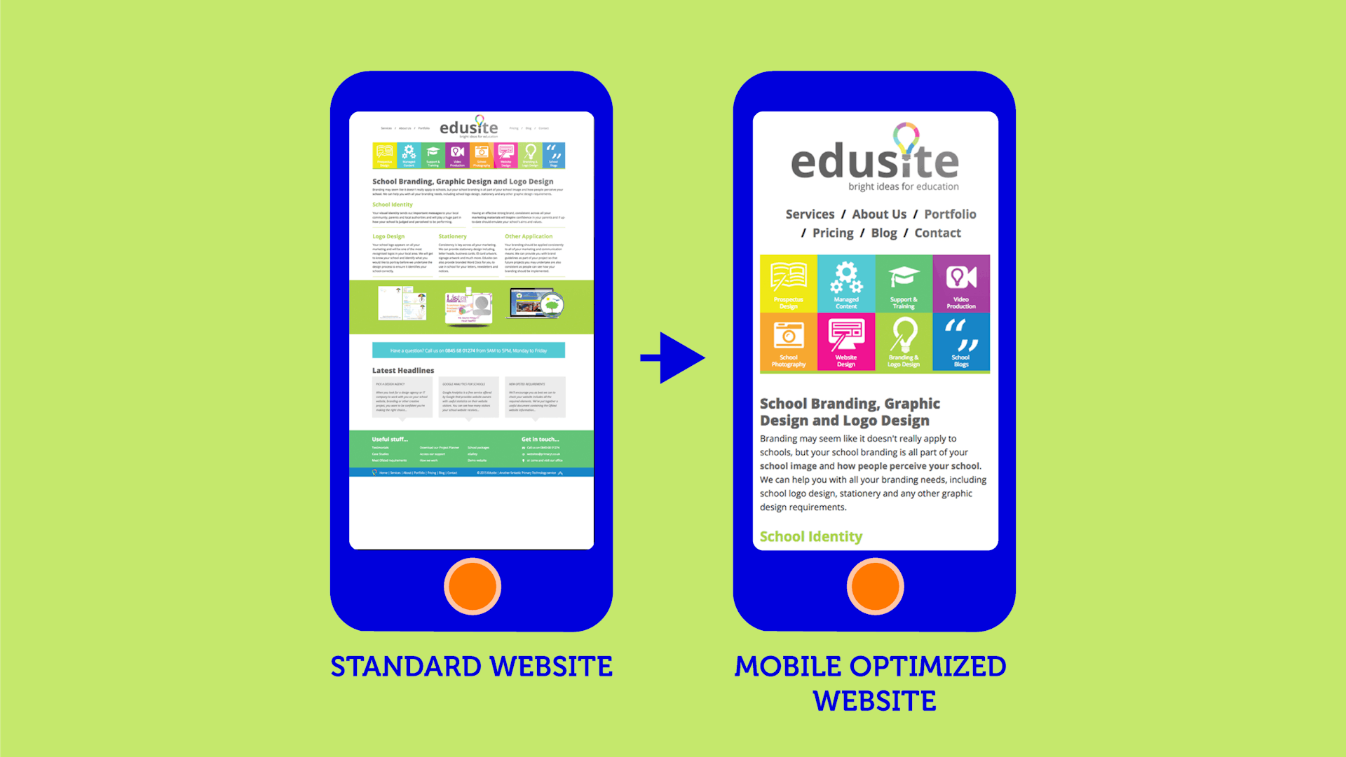
4. Simplify your menus
A laptop screen is way bigger than a mobile one. You know that, right? Let this obvious idea be your guiding light when working on your menu and the whole design in general. That’s precisely when “the simpler – the better” rule is up to a point.
What you can do is to reduce the number of your website sections presented in the menu navigation. Instead of displaying all you have, show your visitors 3-7 main sections. They can find everything else in a drop-down.
To save your customers the trouble of doing multiple clicks, you can give a breadcrumb trail a shot. It is a navigation system, which name came to us from the Hansel and Gretel fairytale. Remember the story about two kids who use breadcrumbs to find their way back home? Just like the main characters, your visitors can be shown their location, although not in the forest but within the website’s hierarchy.
5. Use a search function to your advantage

Simplifying a menu may be an uphill battle for those who have a handful of product categories. Of course, you don’t need to cut your assortment just to accommodate your site to mobile users. There is another way to go, and it’s called a search function.
Not to kill your customers’ interest to your business by a complex menu, let them type in whatever they need in a search bar. That will allow your visitors to get access to the desired products without looking through the numerous menu options.
6. Turn off pop-ups
It’s common knowledge that people don’t like (read: “hate”) pop-ups, especially when they block the view of the whole web page. Hoping that users will throw everything at the search for the tiny X is a waste of time. If they aren’t diehard brand loyalists, they’ll click away in a matter of seconds without giving your site a second chance.
Your visitors will appreciate you getting rid of this type of advertising once and for all. If you can’t do that, at least disable it for mobile. Or set up pop-ups in a way that won’t annoy your customers. For example, let the ads appear when a user is at the bottom of the webpage not just landed on it.
7. Keep your text blocks as short as possible
Unless you’re a blogger and long reads are your bread and butter, massive blocks of text is a definite no-no. You’d better put a premium on visuals. Try to communicate with your clients by showing them stunning photos of your products, and your website will go a long way.
Sure, you need words to lure people into your sales funnel. But don’t go over the top with them. Here are 4 rules to follow when it comes to the text on your mobile website:
- keep your sentences short and clear so that users can comprehend your message without getting tired and annoyed;
- make use of bullet points to present the benefits of your product;
- copy formatting is a must as no one will waste time reading a one-paragraph text;
- leverage text colours, types, sizes and fonts to stand out essential elements in the text;
- complement blocks of text with visuals.
8. Speed matters
People are too busy to wait until all pages of your website are loaded. And statistics is the best proof of that:
- over 50% of mobile users expect the loading speed of webpages to be under 4 seconds;
- 74% of visitors say that they’ll click away if they need to wait more than 5 seconds;
- 46% of buyers say that the loading speed is the #1 reason why they’ll purchase on the website again.
Fortunately, you can expedite the loading speed of your site by keeping it as simple as possible. Just follow the principles mentioned above, avoiding complex forms, sophisticated menus, heavy pictures and a massive portion of text. By simplifying your design, you’ll speed up your website and boost your conversions.
When all is done, and your website is appealing to mobile users, don’t stop here. It’s just the beginning of your journey called smartphone optimisation. The way mobile devices look and function is going to change, and you’d better get a line on all the updates. Keep testing and tinkering with your project, having your users’ needs in mind.
Should you consider one-click payments for your mobile website, get ahold of our customer support team for more information.


 Most Popular Payment Methods in the World: Analysis by Markets
 How to Increase Conversions in an Online Store with a Checkout Page
 How Tranzzo Simplified the Payment Process for Tickets.ua
 Integrating Multiple Payment Methods: Challenges and Solutions
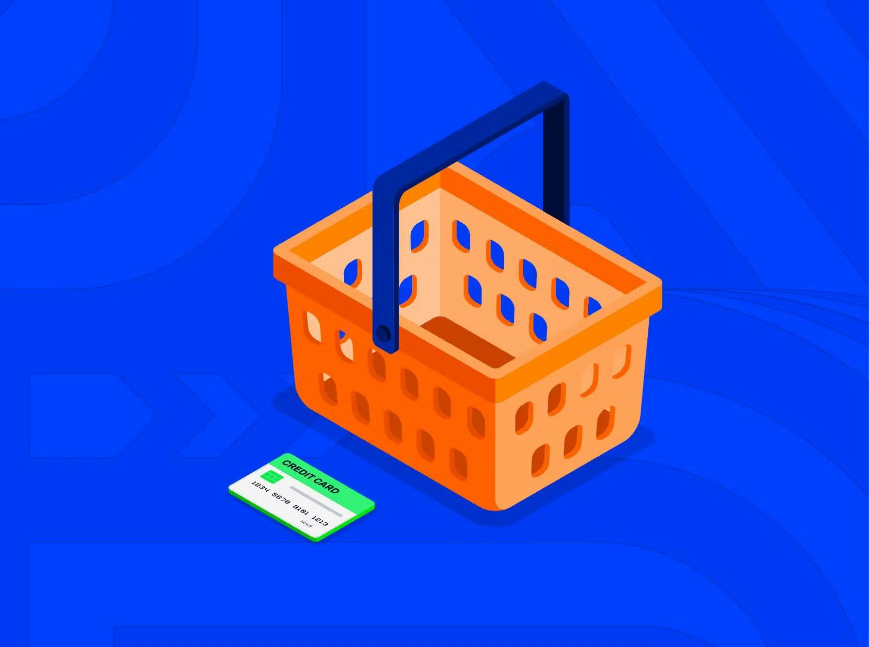 Abandoned Shopping Carts: Why Businesses Lose Revenue and How to Increase the Number of Successful Payments